THE FOUNDATIONS · COLOUR
Six colours. The whole palette.
Your brand guide's four tones, a charcoal for the text and pure white. They serve all four websites and no House owns a colour.
Each colour has a job
- WhiteThe ground of every page, on all four sites
- CreamThe recessed surface: a ritual, a quote, a chapter
- CharcoalAll text, all titles, the main button
- Deep greenSecondary text, captions, credits
- GreenRules, dividers, surfaces. Never text
- ReservedYour guide's fourth tone. When the palette needs to grow, it grows from here, without inventing new colours
The palette on a page
A page from the websites, in miniature. Each surface is labelled with the colour that makes it.
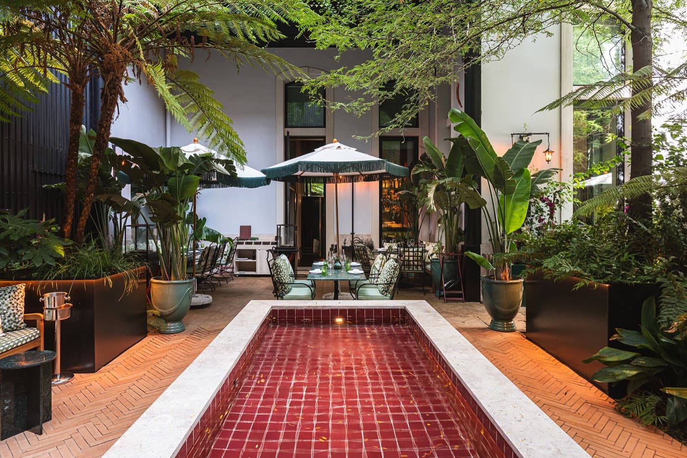
the photograph, the only saturated colour
charcoal: the text and the titles
cream: the house-phrase pause
green: the single surface moment
white: the ground of everything
The mid green never writes
A vindima é em Setembro.
Like this
The green as rule and surface. The text stays in charcoal, on white or cream.
A vindima é em Setembro.
Never like this
The green as text. Pretty from afar, tiring to read, and therefore forbidden by our own rule, stricter than the standard requires.
Why there is no grey
The natural temptation in a soft system is a discreet grey for captions. But the usual grey reads well on white and poorly on cream. Your guide's deep green reads well on both, so it is the text's only second colour.
Two service colours
Your guide is a print palette and never needed an error or confirmation colour. Digital does. The two were defined by us, exist only for forms and messages, and never touch the brand.
- Error
- Confirmation