Saltar para o conteúdo

THE PATH

How we got here.

From your brief to the system, in one line: what you asked of us, what we found in the market and in your own archive, the idea that came of it, and the six decisions that make it a system.

1 / 4

What you asked of us

Before any design, your words. The brief and your brand book say almost everything. Our first job was to read them literally.

Four websites, one system: the Collection and three Houses, Lisboa, Seteais and Santar, each with its own rhythm, all with the same sensibility. The brief assigns the roles in one sentence: the Collection inspires and connects, each House tells, differentiates and converts. And it states the promise in a paragraph that is already, in itself, a design instruction:

The brand promise is not “stay in one of our hotels”. It is “discover how life is lived here”.
Your brief
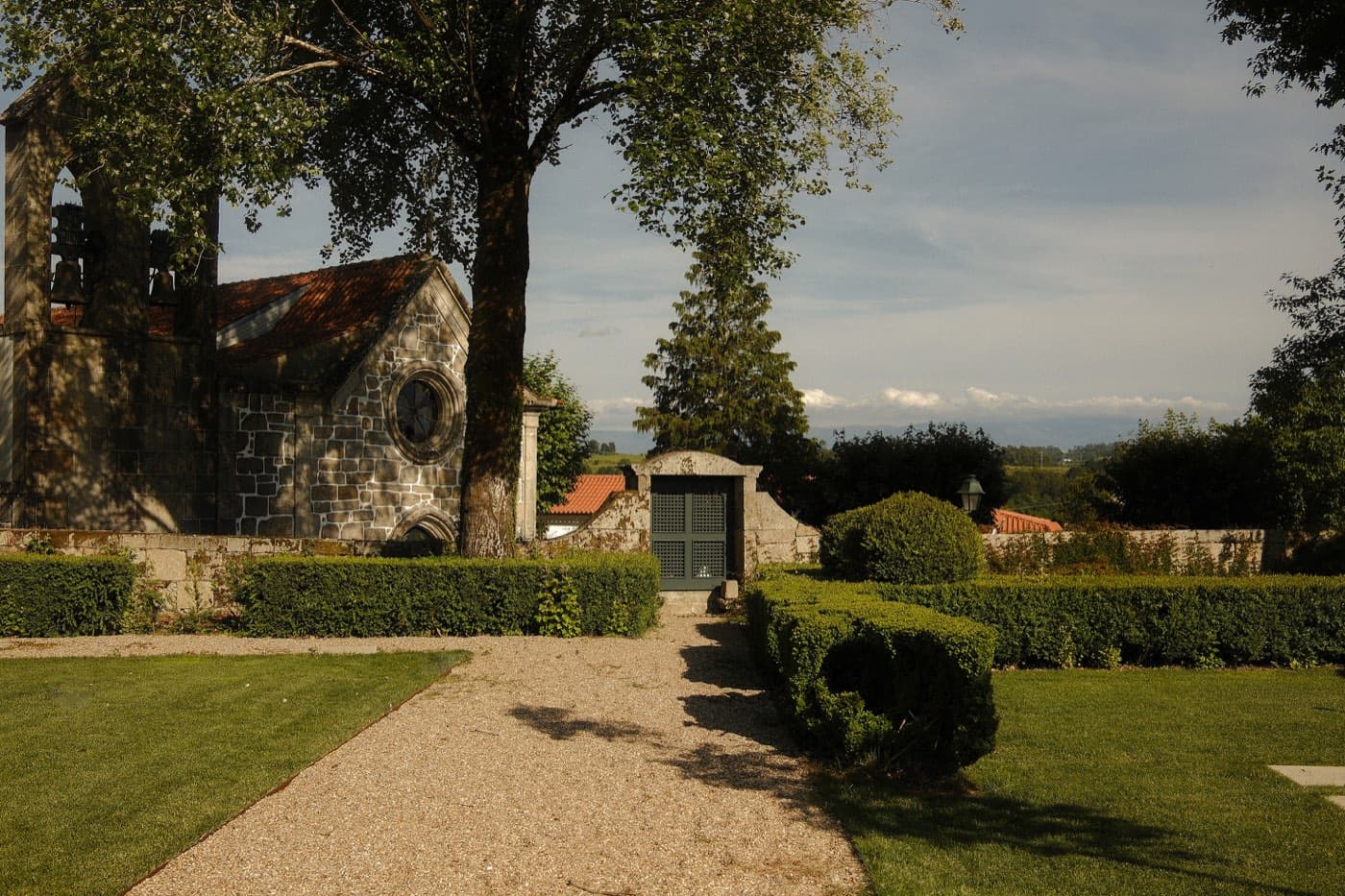
A gravel path between clipped hedges, the house to one side and open country beyond.

The deepest source is not even in the brief. It is in a note of your own, written off the cuff, about what the brand has to get across:

Que somos CASAS. A tua casa fora de casa. O teu palácio, fora da tua casa, mas como se fosse tua, onde tens rituais e acolhimento de amigos, familiares. O tempo para nos nossos hotéis, o ritmo abranda.
Your own reference note. “That we are HOUSES. Your home away from home. Time stops in our hotels. The rhythm slows.”
Há lugares onde o tempo passa. E há lugares onde o tempo acontece. Onde ele abranda, repousa, se reencontra. Somos guardiões do tempo, do tempo das casas, das paisagens, das pessoas.
The brand manifesto. “There are places where time passes. And there are places where time happens. We are guardians of time.”

The brief is just as clear about what Valverde is not:

  • Corporate or formulaic
  • Ostentatious or status-driven
  • Cold, intimidating or overly formal
  • Generic “luxury hospitality”
  • Promotional, noisy or dominated by urgency
  • A collection where every hotel looks and behaves the same

2 / 4

The starting point

  • No typography of their own

    Two of the three sites serve the default system font of any computer. Only Seteais loads brand typography.

    Source: valverdehotel.com · valverdesantar.com · July 2026

  • Nine colours on one site

    Seteais shows nine tones of its own where the category's best houses live on half a dozen. The identity dilutes.

    Source: valverdepalacioseteais.com · July 2026

  • The best showcase is not yours

    Relais & Châteaux shows Valverde Lisboa with nine room types, prices and live availability. Without a single link to your own site.

    Source: relaischateaux.com · Valverde Lisboa page · July 2026

  • The Collection with no home online

    Three separate domains, linked only by a group of footer links. The brief's philosophy has nowhere to live.

    Source: valverdehotel.com · valverdesantar.com · valverdepalacioseteais.com · July 2026

3 / 4

The idea

Before the decisions, the idea. It came from your own archive.

The sentence that organises everything is in your own sales material, on the Santar page. Some places don't ask you to slow down. They simply make you forget there was ever a reason to hurry. And your reference note ends on the same verb: «o ritmo abranda», the rhythm slows. Neither verb gives orders. Both let go. Hence the idea:

Nada aqui pede pressa.
The idea that organises the system. “Nothing here asks for haste.”

A page that tells the guest to slow down is still giving orders. So the method is subtraction: removing from the page everything that asks for haste, from countdowns to scarcity, from pop-ups to carousels that advance on their own, until the calm no longer needs stating. And because you can count what is absent, the idea is verifiable: a list of things that will never be on the page.

Two voices carry the idea, both made of text, both yours. The first is the house-phrase: the fourteen lines you already wrote, «receber em casa», «acordar em casa», «saudades de casa», set in italic, at scale, as the pause between chapters. The second is the plain sentence: one factual line per chapter, answering the guest without persuading them. One warms. The other anchors.

receber em casa

the house-phrase

A casa tem 43 quartos.

the plain sentence

4 / 4

The six decisions

Six structural choices make the system. Four came from the benchmark: we went and looked at the references your brief named, page by page, the way a guest sees them. Two came from your own brand and your own archive. Each decision arrives with analysis beside it.

Decision 1

One palette across the four websites

What we saw

Cheval Blanc gives each maison a colour. And the colour fails.

On one property, white text over the house colour is close to invisible. Any guest feels it, even without knowing why.

Source: chevalblanc.com · Randheli · July 2026

At Belmond, the properties own no colour.

And they still read as different places. Distinction without colour is proven at the category's best.

Source: belmond.com · Villa San Michele · Cipriani · July 2026

The options

A colour per House, as the brief asked, or one palette, shared by all.

The decision

One palette: your guide's four tones, a charcoal and pure white. No House owns a colour.

The cost, accepted

Colour stops telling the Houses apart. That work moves to photography and writing.

  • White
  • Cream
  • Green
  • Deep green
  • Charcoal
AaAa

The same charcoal, legible on white and on cream.

Decision 2

One typographic register

What we saw

At Cheval Blanc, hierarchy never shouts.

There is not one bold or one heavy title on the whole site. What matters is set apart by size and capitals. The page reads calm from end to end.

Source: chevalblanc.com · Paris · July 2026

And your two typefaces are already kin.

Miller Banner and Effra sit side by side as if they had been drawn together. The italic lands mid-sentence without a jolt. Many pairs need hidden corrections to look like a family. This one needs none.

The options

Type per House, or two families, identical everywhere.

The decision

Miller Banner for titles, Effra for text, the italic for destaque. No bold, no third family.

The cost, accepted

No House gains a typographic voice of its own. In return, any partner can implement the system without breaking it.

Miller Banner · the titles

Effra · the running text

o itálico, reservado ao destaque

Decision 3

Slow motion, never hurried

What we saw

Cheval Blanc St-Tropez takes twenty-two seconds to show content.

A wash of colour, a blank white screen, and only then the page. That is not calm. It is absence. Slowing the guest down must never mean making them wait.

Source: chevalblanc.com · St-Tropez · August 2026

Belmond's most eloquent gesture: booking waits.

The booking bar appears only two seconds after the page opens. Commerce waits for the guest to arrive first.

Source: belmond.com · Villa San Michele · July 2026

The options

Total restraint, with no motion at all, or slow, cinematic movement, at the house's own tempo.

The decision

Slow, editorial movement, everywhere: the page settles gently on arrival, chapters reveal at the guest's own pace. Nothing advances by itself, nothing makes anyone wait.

The cost, accepted

It demands discipline: counted durations, at most one ceremonial moment per screen, and the still version remains a complete design, for whoever asks for it.

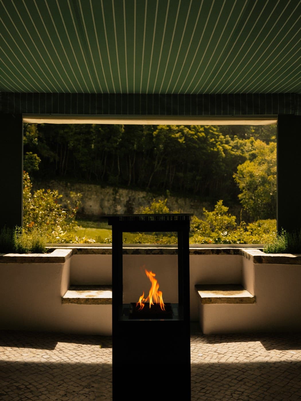
A fire burning in an open hearth under a green awning, the garden beyond.

Slow like the house. Never hurried.

Decision 4

No urgency, anywhere

What we saw

Belmond opens your brief's primary reference with a discount pop-up.

A full-screen ad promises “luxury accommodation for less”. Four booking prompts at first glance. It is, to the letter, what your brief says Valverde is not.

Source: belmond.com · Villa San Michele · August 2026

And yet reading Belmond is reading calm.

In their pages' copy, not once does price, discount, “last rooms”, an award or “five-star” appear. The luxury register is defined by what is absent.

Source: belmond.com · Villa San Michele · July 2026

The options

The usual conversion tools, or their total absence.

The decision

No countdowns, no scarcity, no pop-ups, no struck-through prices. Booking appears after the page has been met.

The cost, accepted

Pressure is given up as a sales tool. In this market, confidence sells better than haste.

Never, on any page:

  • countdowns
  • “last rooms left”
  • pop-ups and overlay ads
  • struck-through prices and discounts
  • badges, stars and ratings
  • exclamation marks

Decision 5

Houses, not hotels

What we saw

Your own proposition, taken literally.

A tua casa fora de casa. The vocabulary was already yours: houses, named rooms, rituals, welcome. The system simply respects it.

Cheval Blanc does the equivalent with Maison.

It writes Maison on every page and never writes hotel in visible text. And no reference in the category puts a booking button on a ritual. A ritual you book becomes an appointment.

Source: chevalblanc.com · Paris · July 2026

The options

Deluxe, Superior, Executive, or your brand's vocabulary: houses, named rooms, rituals.

The decision

Casa throughout the prose, hotel only in navigation. Rooms carry names, never tiers. Rituals carry no booking button.

The cost, accepted

In navigation, hotel stays: whoever is finding their way should not have to learn our vocabulary first.

  • Valverde LisboaHotel & Garden
  • Valverde SeteaisPalácio de Seteais
  • Valverde SantarHotel & Spa

Decision 6

One frame per block, the same on all four
What we saw

Your archive decided the formats.

The great majority of the 172 photographs supplied share the same proportion. More radical crops would cost an interior its ceiling and floor.

The options

A format per House, the format following each photograph, or a fixed frame per block.

The decision

The frame belongs to the block: the opening is landscape everywhere, the detail is portrait. The photograph is chosen to fit.

The cost, accepted

Image shape stops telling the Houses apart. The photographed subject does that work alone.

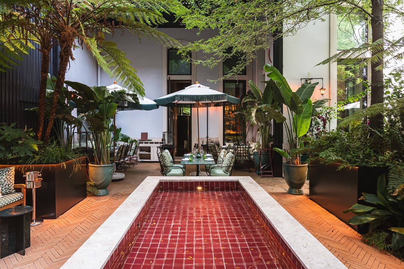
The garden courtyard — a red-tiled pool, tree ferns overhead, tables set beyond it.
The opening · landscape, in every House
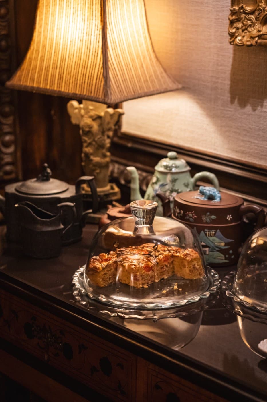
Teapots and a cake under a glass dome on a dark wood sideboard.
The detail · portrait, in every House

From the path to the foundations.

What comes out of these six decisions are rules, and every one of them is written down: colour, typography, space, motion, photography and voice.

See the foundations